BESTBUY · SENIOR UX DESIGNER
Establishing Omnichannel Fulfillment
Best Buy Online Pickup in Store (BOPIS): Well-rounded and optimized experience for online shoppers to quickly and conveniently pick up online purchased items in store in as little as 35 min.
Market study shows 61% of retailers are adopting buy online, pick up in store to meet shoppers' expectation of choice, flexibility and efficiency in how they get their orders.
Data shows the majority of Best Buy customers live within 30 min of a Best Buy store. This means customers can get their hands on the product while avoiding shipping cost and delivery delay.
BOPIS provides peace of mind! It combines the convenience of online searching and price comparison with the instant and safe feeling of being served immediately once you are in the store.
I won the Associate of the Month Best Buy Award for my work and the design effort got recognized by the Best Buy Canada president.
Project Overview
The Challenge
Now more than ever, it's important for retailers to deliver products to the hands of customers where and when they want them. The need for this convenience and flexibility became even more prominent during COVID-19.
During COVID-19,
- Best Buy Canada needed to respond to Health Canada's mandate to minimize physical contact for Canadians.
- Due to a spike in online orders, Canada Post delivery timeline increased by 40%, meaning customers were not receiving their item on time. And there was no safe way to pick it up in store.
The Goal
To combat this challenge, the design team worked with a cross-organizational squad team to deliver a paid pickup solution in a very short time.
The solution:
- Instills confidence and trust by allowing customers to have control over how they receive their products.
- Increases brand loyalty and awareness by responding to customers' wants and needs for a convenient fulfillment method.
- Decreases operational cost for business by optimizing internal tools for store associates to prioritize order processing based on different fulfillment method.
My Role
I was the lead designer working with 2 other UX designers, a UI designer and a UX writer as well as collaborating with a cross-functional team from marketing, store operations, finance and many more.
- Gathering data by evaluating current functionalities, looking at usage data, interviewing customers and store associates as well as working as a store associate to experience it first hand.
- Competitive market analysis through online research to learn about the best practices and market standard.
- Brainstorming and quickly defining guidelines for information hierarchy and interaction flows.
- User flows, wireframes & interaction patterns in low fidelity (pen and paper) and high fidelity (Sketch).
- Collaborating and streamlining the effort across multiple departments from developers to store operations to ensure well-rounded service design is delivered.
- In-person user testing and observational study to monitor the impact of the launch and iterate based on customer and associate feedback.
My Process
At the time, Best Buy was offering a reserve and pick up capability with no need to pay for the order. This meant customers needed to pay for their purchase once they arrived at the store.
Discovery and Data Gathering
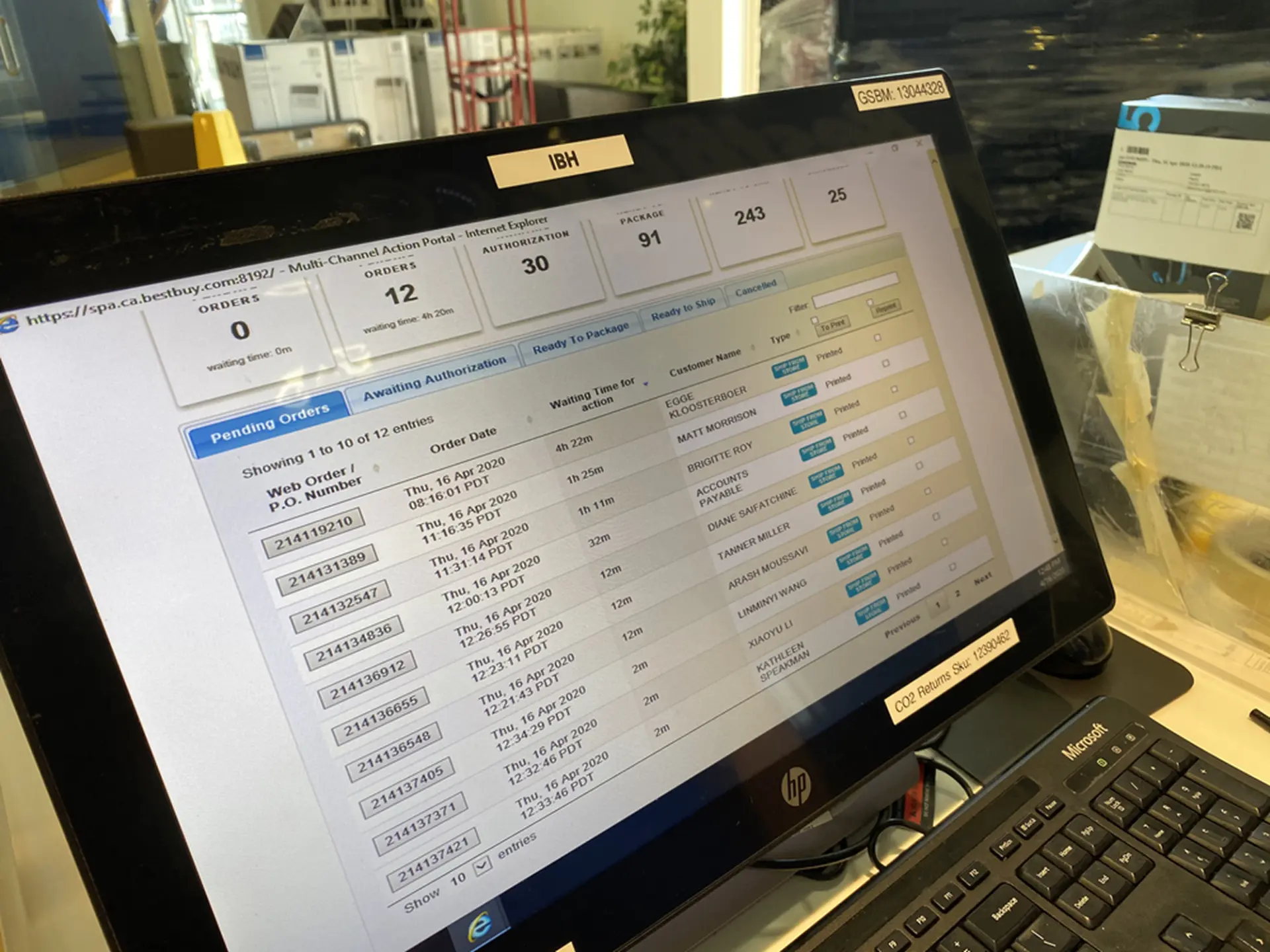
I started with gathering known data, customer feedback and learning the current workflows. I interviewed store associates, and also worked as a store associate in store helping customers with their reserve and pickup orders.
Customer and Store Associate Flows
To analyze the challenge and design a well-rounded solution, I needed to understand the current web functionality as well as the customer and Best Buy associate pain points online and in store.
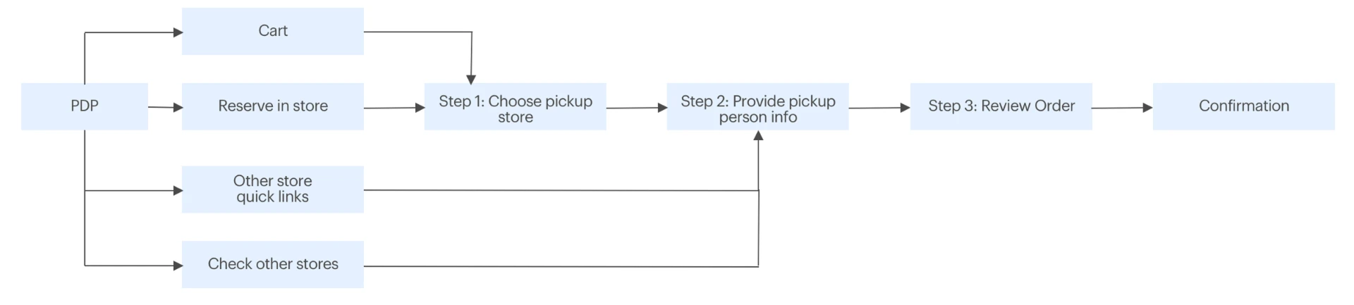

Research showed that customers were not satisfied with payment processing during pickup. COVID-19 escalated customer and associate frustrations even more because of the close contact requirement between them in order to have the payment processed upon pickup.
Customer feedback
"I am frustrated because I can not find the reservation desk and I need to find a person to ask."
"I am frustrated because I was not expecting to wait for this experience."
Store associate feedback
"Customers don't pick up their reservation."
"Customers reserve more than one item, which makes it difficult to remember."
"Customer expectation is not met and they are frustrated."
Defining Audience and Goals
There are two major audiences for this solution: online customers and store associates.
Customer Goals
As a customer, I want to:
- Have flexibility and feel empowered on how I get my product.
- Quickly and easily get my product and avoid shipping costs and delays.
- Have minimum contact and safe pickup.
Store Associate Goals
As a store associate, I want to:
- Have a robust and frictionless tool to help me locate, prepare and package the item in a timely manner.
- Maintain health and safety for myself and the customer.
How would I measure success?
A set of KPIs to measure success:
- Increasing customer satisfaction in the post purchase survey
- Increasing pickup rate (current pickup rate was 50–54%)
- Reducing operational cost
Online Research
After defining the problem and the audience, I looked at 7 competitors from North America and Europe from various industries. I identified industry standards when it comes to buy online pickup in store.
Common practice is to have a single entry point to cart with visible fulfillment types.
Constraints and Scope
Some of the constraints my team and I needed to take into account while proposing a minimum viable experience were:
- Two-week turnaround time
- Using current functionalities to expedite the implementation and not introducing new systems
- Legacy tools for order processing and communication to customers
After defining the problem space, customer and store associate goals, and based on constraints, as a team we identified the smallest slice of experience that would deliver value within 2 weeks.
Iteration 1 — Wireframe and Interaction Design
For MVE we started with existing functionalities and tweaked them to allow quick launch and fast iteration.
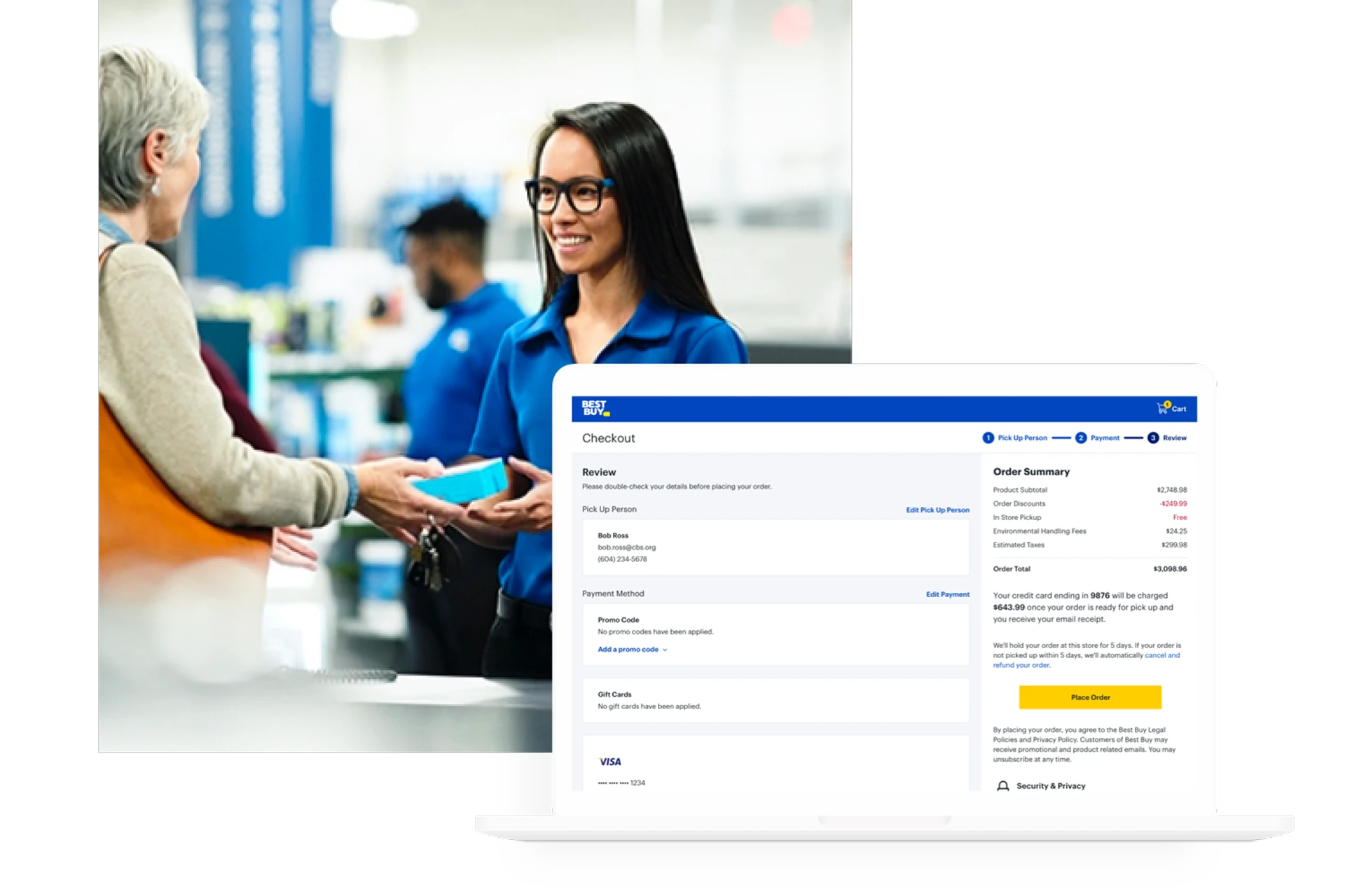
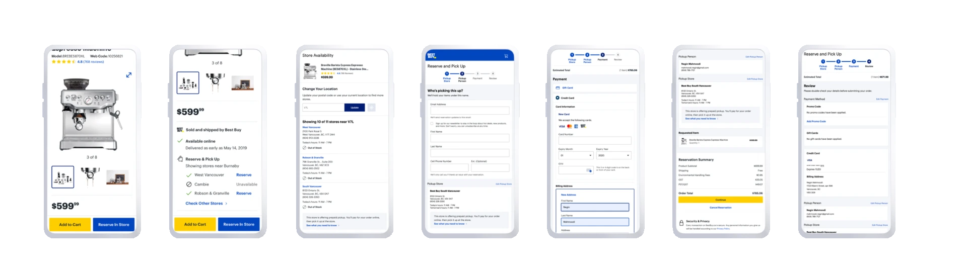
We used the existing reserve and pickup call to action on the product details page, added payment steps, redesigned the confirmation page and created new emails to guide customers for a smooth and convenient pickup experience once they are at the store.
Cross-departmental Collaboration
My team and I worked with the store ops team to define the pickup steps for both driving and walk-in customers.
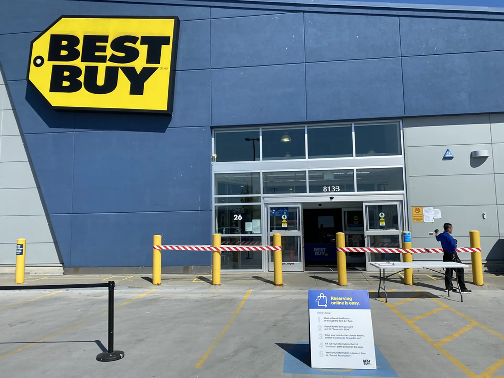
We worked collaboratively to introduce a designated area near the entrance of the store for paid pickup purchases. We worked on the information design for signage, instructing the customer to call a dedicated phone line and have their order number ready. Once they talked to the store associate, they wait for the associate to bring their item out.
The first slice of the solution was enabled for a number of pilot stores in BC.
In-Person Observational User Study
We decided to roll out to a limited number of stores to monitor the impact of the launch and to have time to run user tests in order to deliver an enhanced design for the national launch.
After we launched, I went to the store to perform an in-person observational study on both customers and store associates. I observed 2 store associates as they were going through the experience, and interviewed 3 customers and 3 store associates to understand their pain points.
Since the design was based on an existing reservation pattern, customers had preconceived knowledge about the process and speed of order readiness. I learned that:
- Customers were not reading the new pickup instructions provided on the new confirmation page.
- Customers were not reading their email and were showing up to the store before their order was ready.
- The new paid pickup took around 164 min for the payment to get processed and for the ready-to-pickup email to be sent out. This conflicted with the previous processing period of only 20 min, so many customers showed up before their order was ready and had to either wait outside, come back later, or cancel and repurchase in store.
This was causing a lot of overhead for the store, and frustration and wait time for customers, which was against the initial goal and vision of quick and convenient pickup.
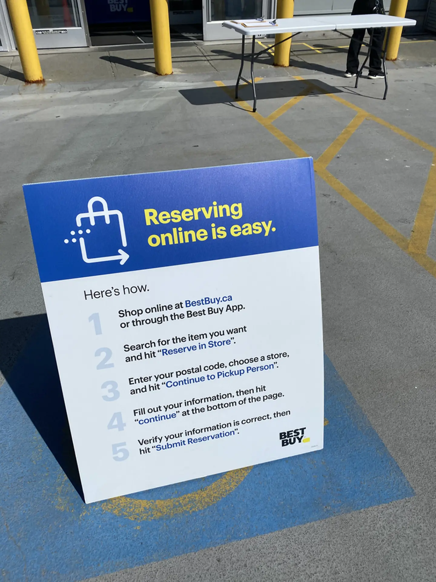
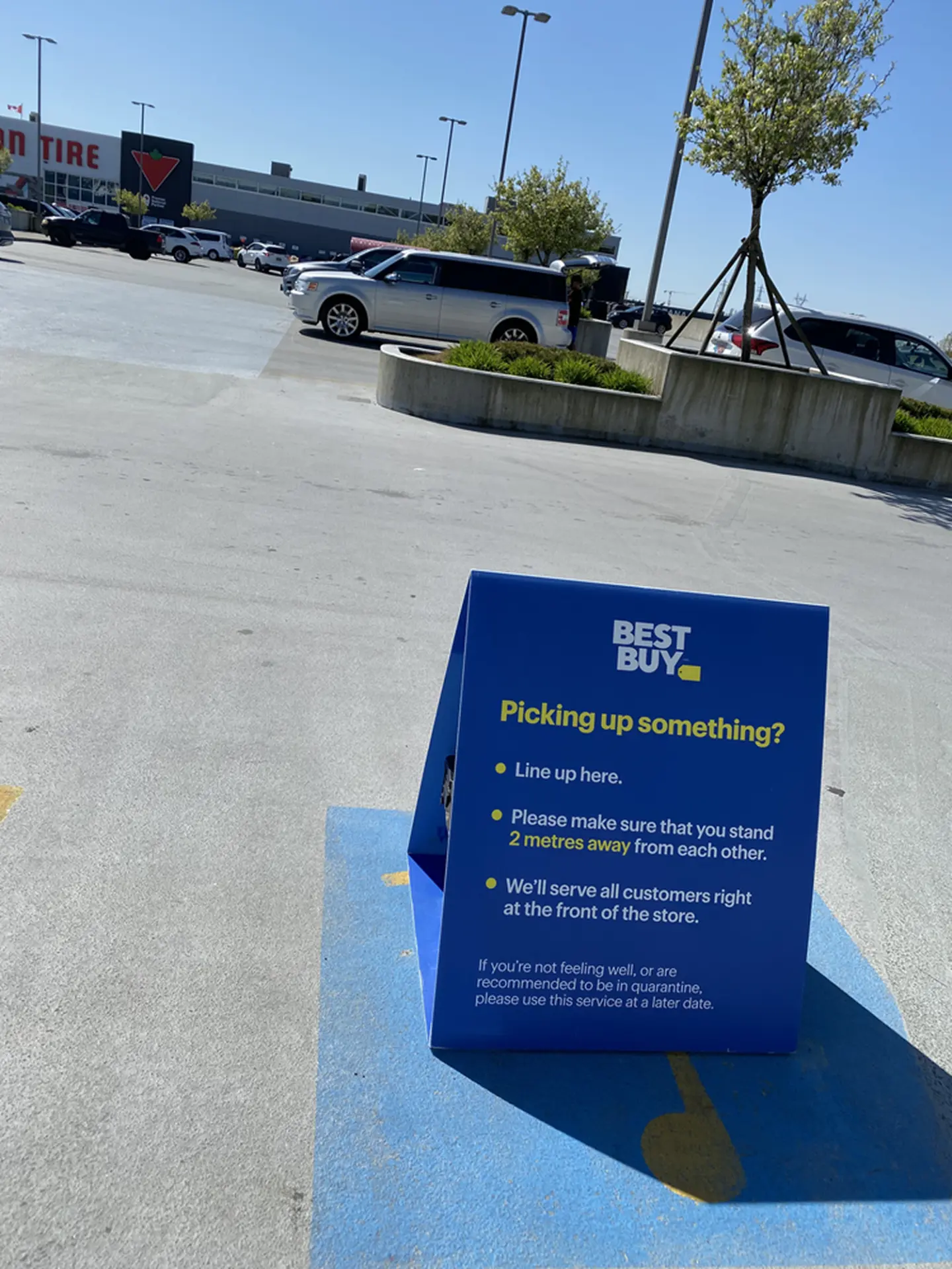
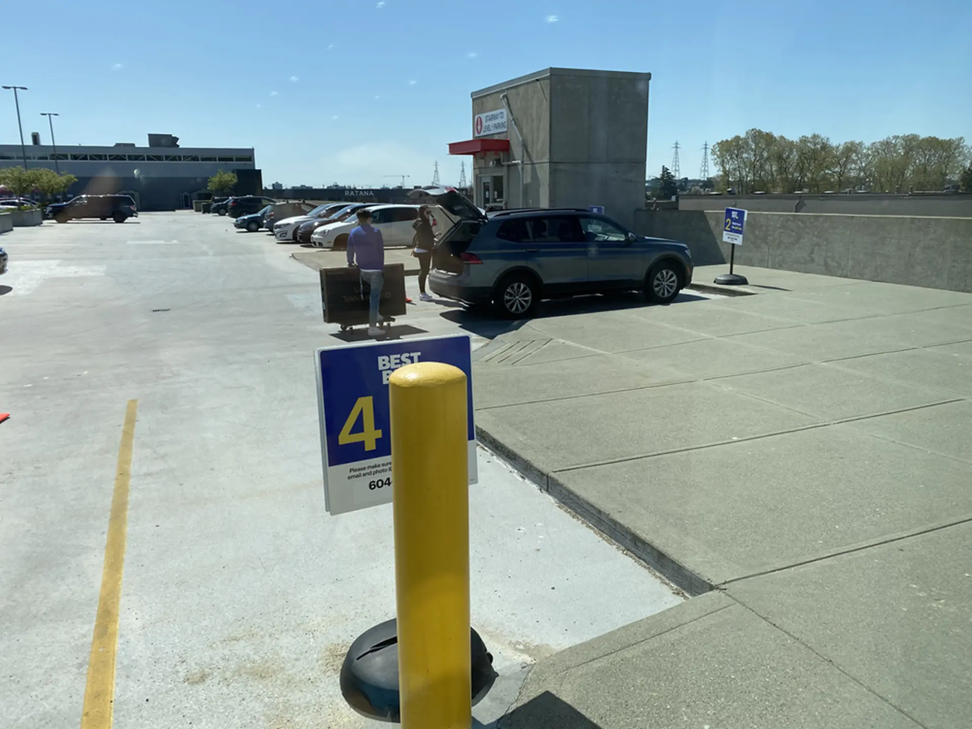
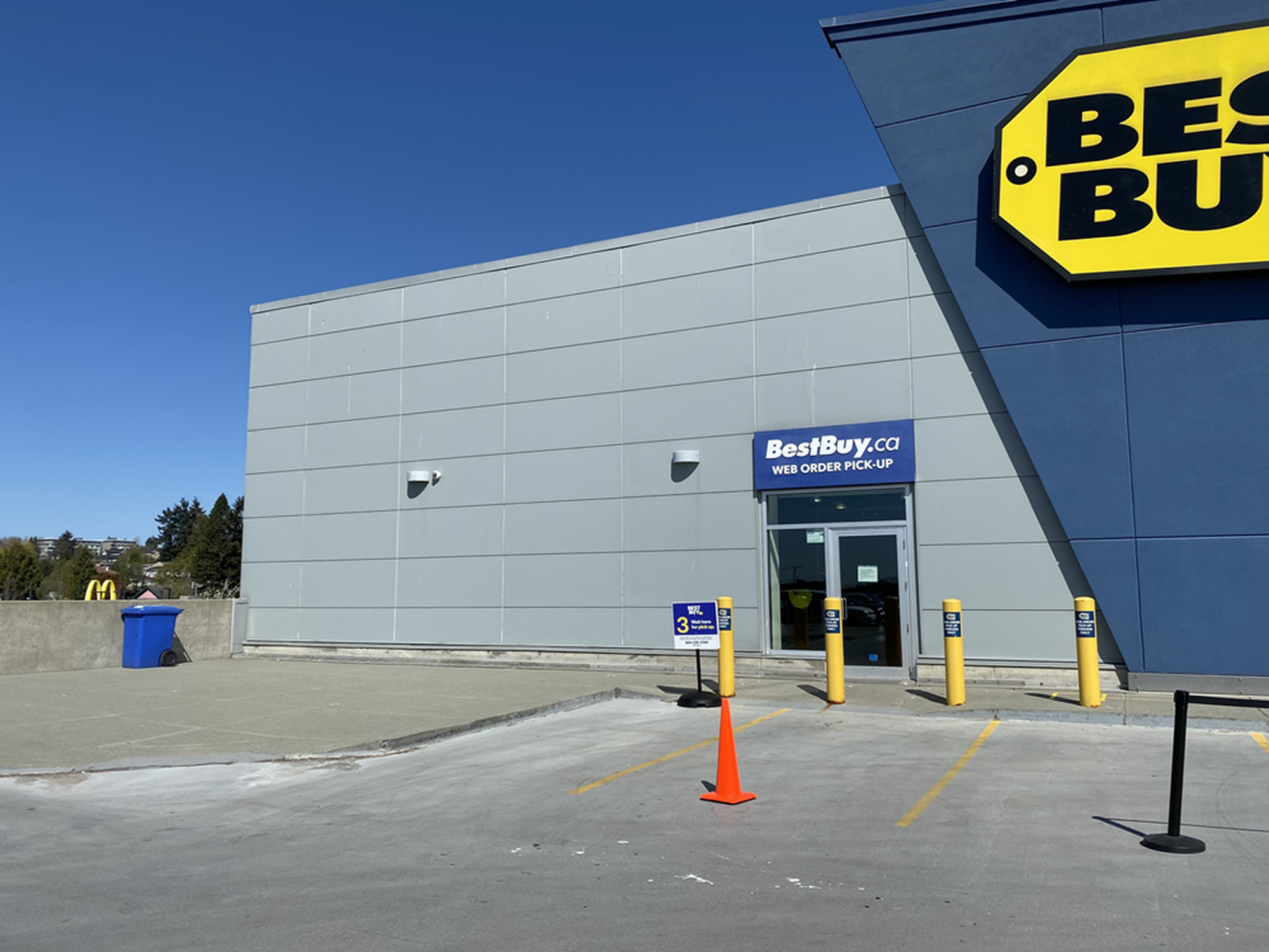
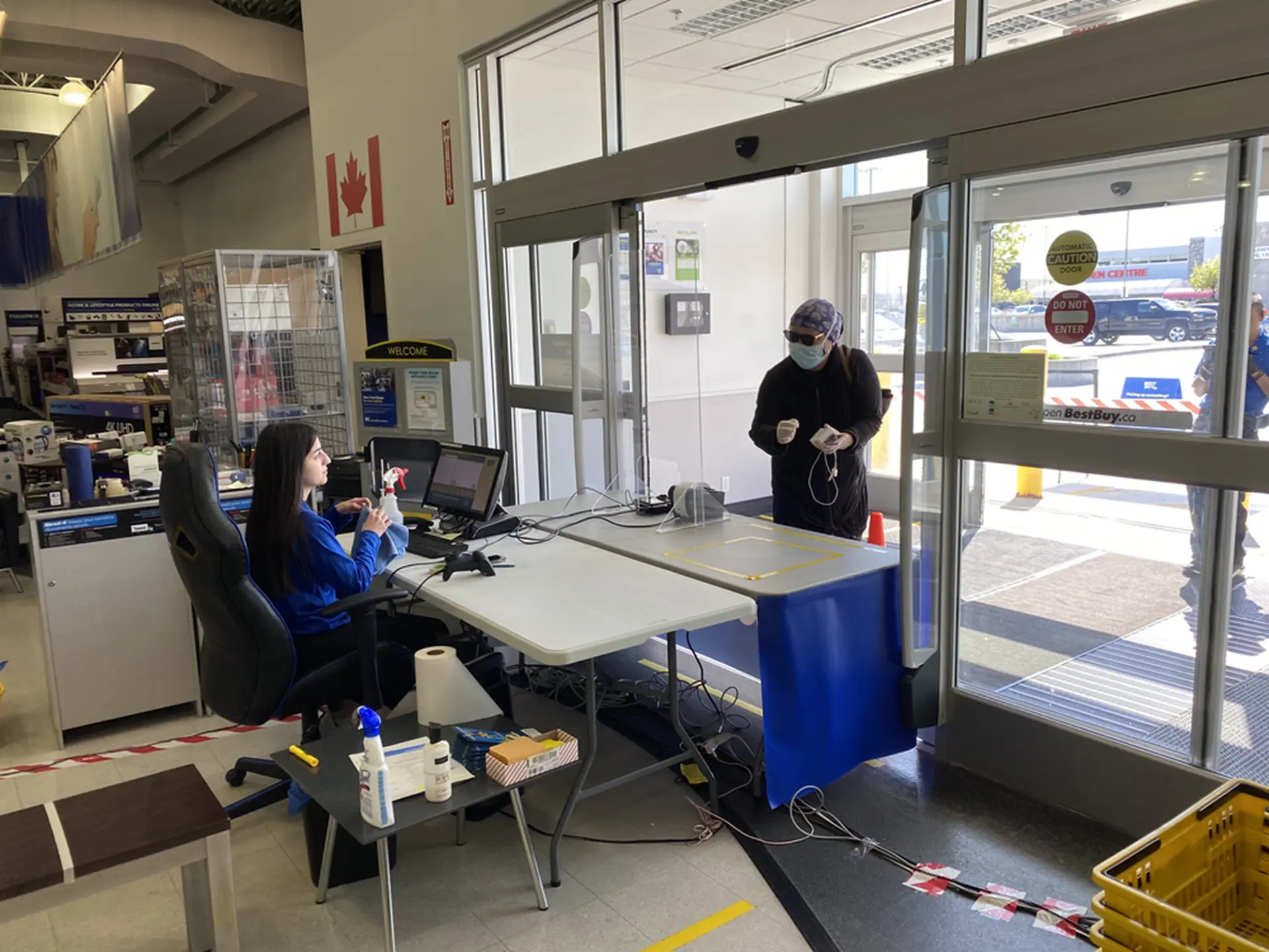
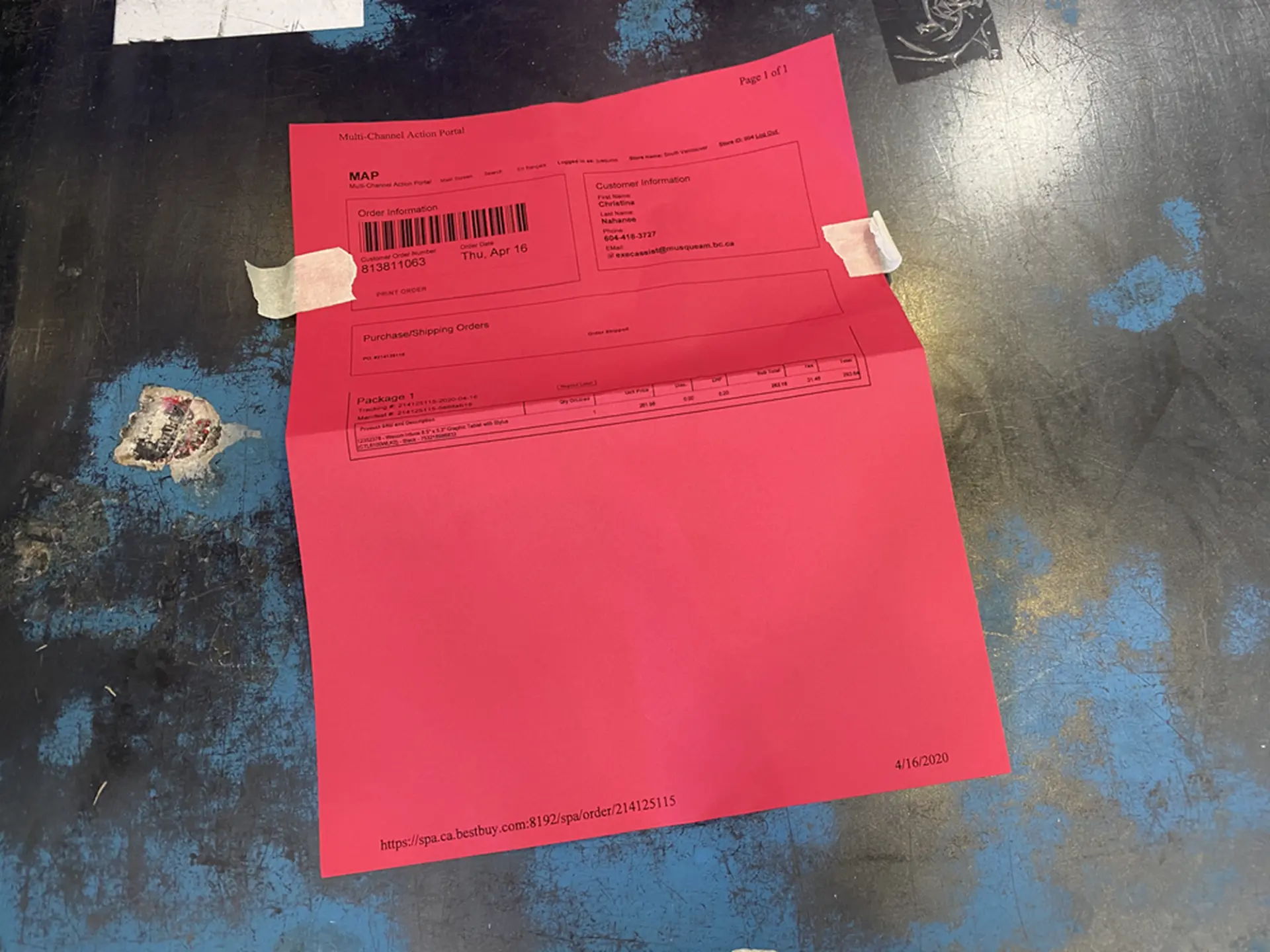
Another observation was that store associates could not distinguish paid pickup orders easily in the system and had to manually print them on colored paper to prioritize processing over other orders.
UI Design and Copy
Since there was a precedent design, UI design followed the previous standards that were set.
The vision for UI and copy was to match the real world with the paid pickup design, bring more clarity and instill confidence. The design encourages consistency across platforms and screen sizes by using known elements and patterns. The copy is simple, conversational and speaks in a human way.
Iteration 2 — Before and After
All the above observations resulted in us focusing on the next iteration to address the pain points customers and store associates were experiencing.
From talking to the engineering team, I learned that the payment authorization step was causing a delay for the ready-to-pickup email to be sent out.
In the new iteration, we decoupled the email from the backend process, reducing the ready-to-pickup time.
We also redefined the steps on the confirmation page to clearly communicate the next steps, including the necessity to wait for the pickup email before heading to the store.
Moreover, a new tag was added to the internal tool for Best Buy associates to easily differentiate between order methods and prioritize paid pickup orders because of their time sensitivity.
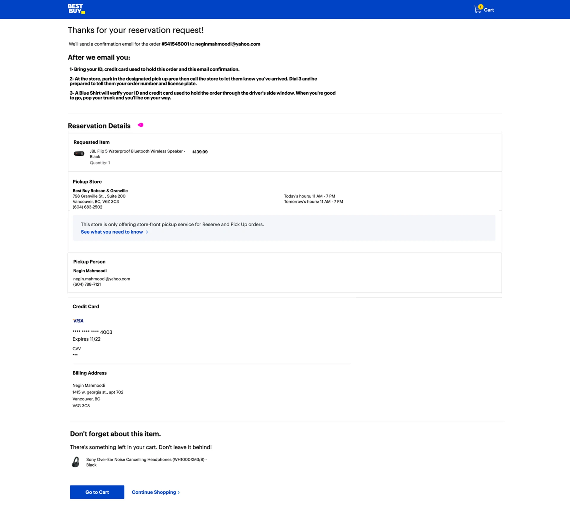
Iteration 1 · Confirmation page
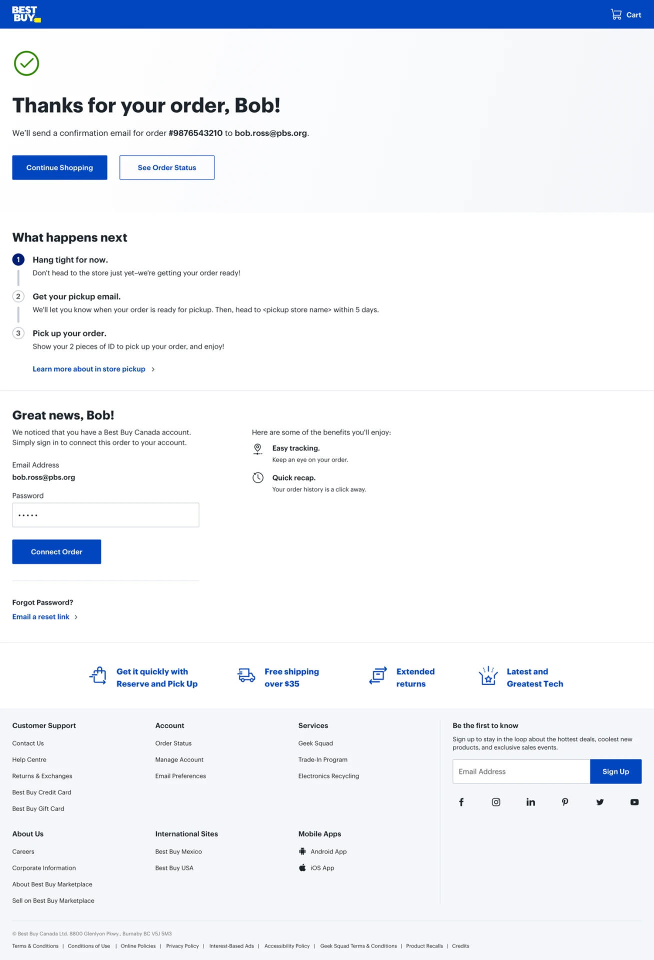
Iteration 2 · Confirmation page
Results
- Approximately 35% increase in pickup rate, from 50–54% to 88%.
- Reduced the time from 164 min to 35 min to send out ready to pick up. This reduction of over 2 hours boosted customer confidence and trust and gave us a competitive edge compared to retail industry standard timelines.
Next Iterations
We are working towards the north star and the ultimate vision for this functionality: to transform the paid pickup capability to be shown as a fulfillment method.
We are also adding the capability of warranty attach as well as the ability to pick up big items from the store.
What I Learned
Design is holistic
I collaborated with so many people from multiple departments who are responsible for customer journey touch points. The unity allowed me to look at design holistically and come up with a well-rounded experience. This was a true service design experience, from awareness to web and all the way to the store design.
Experiencing first hand is the key
Working as a store associate and performing an in-person user study allowed me to get a true sense of the experience. Going through the end-to-end process revealed the nuances of design. It showed me the need for design in every single step, and that I should focus not only on the online experience but also account for the in-store experience.
Thanks for reading.
← Back to work